

I also update a wordpress page its got all of the information the same as this blog but its for people who also like using wordpress.
Sunday, 31 January 2010
Saturday, 30 January 2010
Kenco 'Less Packaging' advert
You’ve probley seen it on all the channels, but with my new packaging project I have decided to base it on less packaging.
And when seeing this advert on T.V i decided was some brilliant research.
To see the advert click the YOUTUBE link below.
And when seeing this advert on T.V i decided was some brilliant research.
To see the advert click the YOUTUBE link below.
Monday, 25 January 2010
Tuesday, 19 January 2010
Forbidden Planet – British Icon.
I have now chosen who I am going to base my toy packaging on and its going to be…
RICHARD BRANSON.
- Richard Branson

He is obviously a very rich man and a great britsh icon, I am very happy to be studying him.
If there is any information that you would like to enclose about him to help with my re search then feel free to write in the comments part of this post.
Will post when I have put something together!
Tuesday, 5 January 2010
January 2010, New Brief
PACKAGING - Forbidden Planet
We have now been given a packaging project to do, which means we have been asked to design a packaging box for a certain sized toy.
The toy is 6 inches x 1 inches, and has to be based on a British Icon.
As well as it having to be designed in the reflection of the persons image and ideals.
It has to have compulsory things on the box, such as the barcode, place of origin and also a clear window so that the toy can be seen through the packaging.
I am really looking forward to this brief and have been doing research over the christmas period, and am now just producing some sketchbook work.
:)
Friday, 18 December 2009
All Finished for Christmas!!
Today was the presentation for TYPE COACH.
I wanted to show my biscuits that I had made for it, but didn't get time in the presentation which I was a bit gutted about.
But, after using just 3 out of the 26 that I made, they looked good in the packaging that I had made to keep them fresh to give out.
Basically, I did this as when the type coach is driving around to different places and various school/college children/teenagers will be seeing this. They could give out certain biscuits or cakes, but not just any you buy from Morrisons!.. making them in the shape of letters of the alphabet. I actually came up with the idea of after making these letter biscuits, iI then wrap them in clear celefane then seal them, then add a tag or a sticker to the bottom of them, (which is where the ingredients goes), and instead write some information about a typographer, or in this case I just wrote the typographers name with the initial of their second name for the letter used.
I loved this idea, and think that it would work well, although my final product didn't involve the biscuits it was a brilliant idea, and could still be used with the new idea as a double based idea.
See the images below for the look of the biscuits after they were 'packaged'.
:)
Tuesday, 15 December 2009
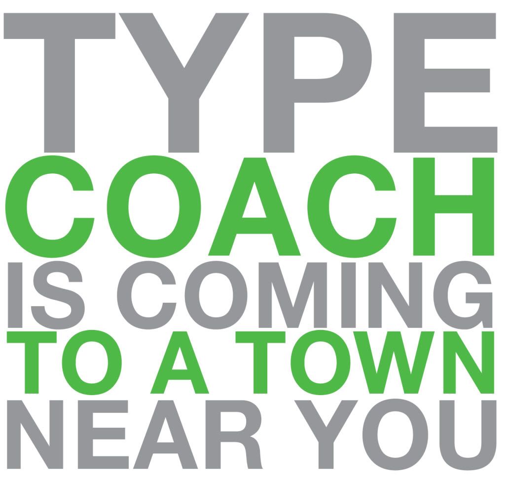
Type Coach Possible Logo Design
I want to base my brochure on a pastel green and also grey, I think the colours work well together, and they also compliment each other.
I want a bold logo, but not too indepth as i don't want to take away from the brochure, but also want to show its typography.
:)
Friday, 11 December 2009
Type Coach
Had a new brief given to us about 2-3 weeks ago, called Type Coach which basically is a coach that carries different typographers round to various stops in the UK, this isn't real by the way.
We have been asked to produce: Business Card, Compliment Slip & Letterhead as well as a 4 page brochure.
I am really enjoying this brief at the moment, as it is quite fulfilling.
I'm not gunna let out any of my plans but what I will say is that i'm loving the ideas that i've got!
Watch this space!!
:)
Thursday, 10 December 2009
Film 4 Poster Exhibition
The exhibition went really well, all of the posters from first year and second year were put up in the gallery.
First years was based on a play called 'Into the woods'. A project I am not familiar with to be honest, as i didn't do this one in the first year.
I have received my marks back from the Film4 poster, and the sketch book and got Merit/Distinction which i'm really happy with, its an improvement from my last project and i really enjoyed it.
:)
Tuesday, 17 November 2009
BBC ORCHESTRA DEADLINE
Right well, lets be honest i didn't do very well on this one! Its not the right attitude but it was so boring!!
I got through on a pass which isn't the worst but i am going to work my socks off on my next brief! :).
Here is an image of my final piece, the BBC ORCHESTRA.
It is aimed at students at college or univerisity.
Its not my best piece but personally its not as bad as others!
Enjoy.
:)

Subscribe to:
Comments (Atom)